Website Design Best...
Website Design Best Practice: How to Optimize User Flow

Website Design Best Practice: How to Optimize User Flow
Website design is about more than aesthetics. Some websites are visually beautiful but challenging to use and navigate. The best sites are designed with user flow in mind. This method puts the user at the center of the design process and offers a better overall user experience.
In this article, we’ll review website design best practices and look at some strategies you can use to optimize user flow. Before we get too far into the article, let’s cover some of the basics.
What is User Flow?
A user flow is a visual representation of the user’s journey through a website. If you run an ecommerce website, the user flow traces the user’s path from the moment they arrive on your landing page to the point of checkout. Here’s an example user flow for an eCommerce site:
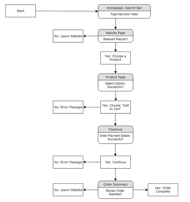
Most user experience (UX) designers visualize user flows using flowcharts. These are similar to the flowcharts used by programmers. Designers use them to evaluate user decision points and increase the chances of lead conversion. In the remainder of this guide, I’ll discuss strategies you can apply to optimize your user flow.
Map Out The Ideal User Journey
To understand how users interact with your website, and optimize user flow, begin by creating a customer journey map. Create an ideal buyer persona, including their goals and the problems they would like to solve. These goals are the main reason they visit your site.
Once you’ve identified their customer’s goals, create maps that would logically link content on your site together. This often involves internally linking between relevant content, or making sure that appropriate content is accessible through the main menu.
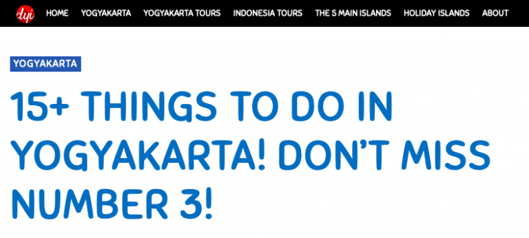
For example, on my wife’s travel site, I’ve created an adaptive menu. When a person arrives on a page about the city of Yogyakarta, they are presented with information about the location through the menu. Placing contextually relevant information on the menu helps channel visitors across the site and to key sales pages based on their likely interests.
Identify Your Most Popular Pages
The theory of how people will use your site and the reality often diverge. When reviewing actual user flow, I recommend you look at the pages on your site that get the most traffic. The best way to do this is by using Google Analytics. The Site Content tab will show you a graph of total views for your site during a specified period and break it down by page.
You can then review these pages and see where traffic is flowing from these pages across the rest of your site. Making changes to the UI can help improve user flow across the site. Such changes can include adding call-to-action buttons and internal links from these core pages to your sales pages.
Identify Visitor Chokepoints
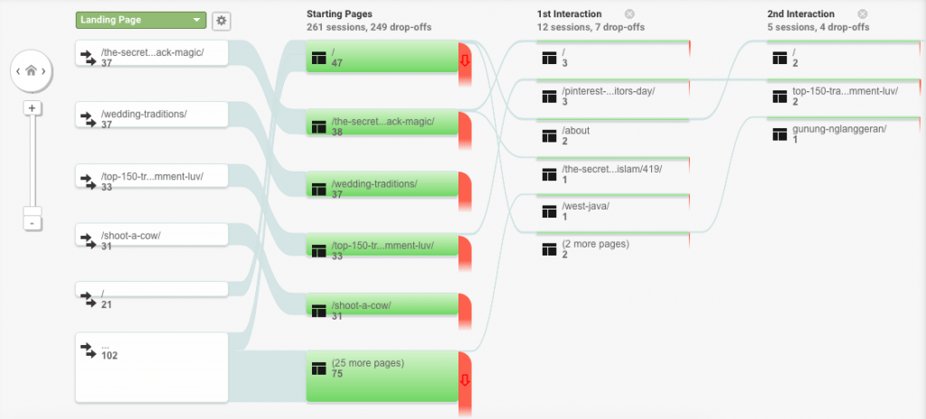
You can review visitor user flow through Google Analytics. By looking at how people use your site, you can identify where prospective customers drop off and leave the site. These are known as chokepoints.
You should go to the page and hypothesize the possible reasons for the person leaving when you identify a choke point on your site. They might be general issues, for example, a page loading slowly. However, they are more likely to be specific to a page. Review the page and try to find a solution. You can use tools like heatmaps and screen recordings to aid your reasoning.
Focusing on chokepoints helps you to remove problems, making the site easier and more pleasant to use. Any time you can remove a choke point in your user journey, take away a reason for a prospective customer to leave your site.
Shorten the User Journey With an Intuitive Menu
A golden rule of website design is, “Don’t make your user think too hard.” Your user should be able to find their way around your website easily and quickly. An intuitive menu is a critical part of making your site navigable.
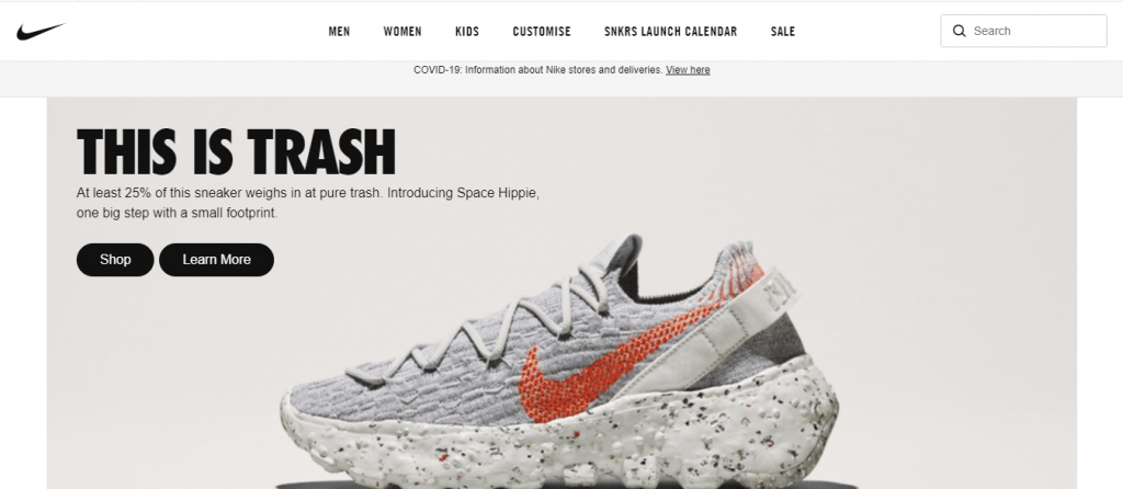
The best way to do this is to divide menu items into clearly-labeled, easy to understand options on the home page. The Nike ecommerce website, pictured below, has a great example of an intuitive menu. The products are all accessible through the menu options at the top of the page, sorted into easily understandable categories.
If you have a site with a lot of content, you might use a sidebar menu with popular content to help users navigate the site. The addition of links to popular content in the sidebar is one of those basic CRO tests that consultants run when they review a site.
Create Content That Lives Up to Expectations
Improving the design of your website can help improve user flow. However, it is just one component of the journey. The other half is the content that you provide on the site.
A great headline is useless if the content doesn’t match it. Most users will only scan your content for a few seconds before deciding whether it’s relevant to them. You need to ensure that they come away with the sense that the content you are delivering is worth their attention.
Remember, visitors to your website are online, and just one click away from a funny YouTube video, Netflix, or any other source of entertainment. Your job is to stop them from leaving. Ideally, you want them to make a purchase or sign up to your email list before they do.
Reduce Navigation Options On Your Sales Pages
Once they’ve arrived at your target page, which for most businesses will be a sales page, you want to reduce their navigation options. You can achieve this by limiting the number of internal links on the page.
You’ll notice digital marketers apply these strategies when creating a funnel using sales funnel software. For example, if you got to a webinar registration page, generally, the only thing you can do, apart from entering a new URL in the browser, is to enter your email address. There’s a reason for this.
Reducing the exit paths from key pages on your website will help maximize the number of people who take your desired action. You should try to do this on your key pages in an intuitive and user-friendly way. That doesn’t mean suddenly removing the menu, but it almost certainly means not linking out to blog posts from your sales pages.
Collect Contact Details With an Exit-Intent Opt-in Form
Not every customer journey ends as you’d hope. However, their visit still represents an opportunity. An exit-intent form can stop users in their tracks just before they leave your site, giving you a chance to get visitors to join your email list or visit a relevant page on your website where you provide a special offer.
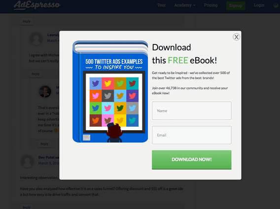
The best way to get site visitors to give you their email address before they bounce is to offer an irresistible incentive. You could give them a free eBook, as Ad Espresso has done in the example above. You could also provide an exclusive discount or freebie.
Your exit-intent opt-in form should be as simple as possible. Two fields, name and email address, are ideal. If you’re running a B2B business, you might also ask for their company’s name.
Optimizing User Flow by Following the Customer Journey
As you analyze your website, put yourself in your visitors’ shoes. Better yet, involve your users in the process of analyzing and optimizing your website’s user flow. Customer feedback is invaluable and will help you identify ways to make the site more responsive and intuitive.
By mapping out the customer journey and learning about how visitors interact with your site, you can reduce your bounce rate and increase conversions. Simple strategies to improve user flow include resolving choke points, using intuitive menus, keeping your visitors’ focus, and using exit-intent forms. Now it’s time to take action – Best of luck!